A new look – Reflections and memories on our new web presence.
We took up the renewal of our web presence. And who satisfies our own high standards better than us? It was for this reason that the entire process was in our hands and was not given away until successful completion. We are proud of the final result. What is not obvious are the steps, ideas, challenges, and decisions that have been made to make the website look the way it looks. With this blog post we take up these aspects and give you a look behind the scenes of the process.
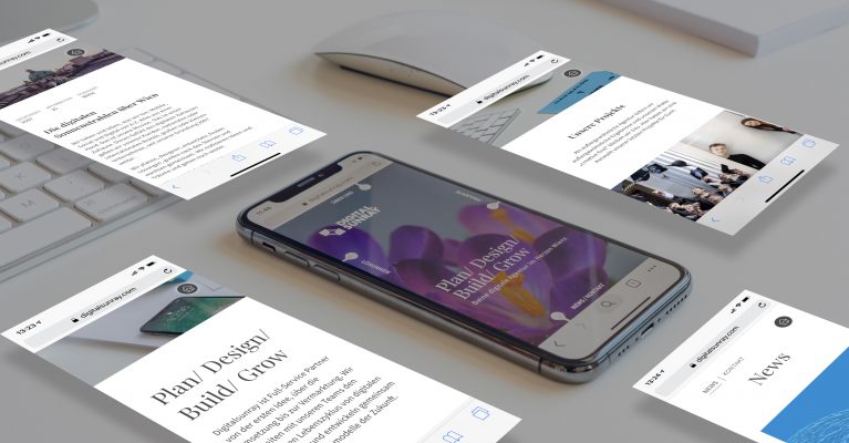
With our new claim Plan / Design / Build / Grow we summarize our comprehensive service package and communicate a clear positioning. We accompany projects from the first idea, through the creation of designs and concepts, through implementation up to marketing. In terms of design, we first faced the following challenge: how do you get a feel on the start page about who or what digital sunray is and what services are offered, and how do you maintain the curiosity of visitors?
How to translate our claim into an comprehensible imagery? Art Director Barbara and our graphic design team quickly understood and solved the problem. Anyone who has visited our website will notice an animated video on the start page - a brief illustration of a flower that turns into a real blooming flower as the video clip progresses. The transition from the initial illustration of a crocus blossom to a real blossom shows that it only takes a good 20 seconds to seamlessly combine the different disciplines from illustration to animation.
We create symbioses from the first "brush stroke" to the actual implementation and work with attention to detail. The development of the animated flower illustrates our corporate philosophy. The symbolization of the cycle of the project cycle by means of a flower, which emerges as a sketch and turns into "real", colorful life, we find very apt. We hope you do too. With the playful, lyrically purist start page, we want to emphasize our preference for visual language. Less is sometimes more. Visiting the subpages, the main focus is on the sufficient transmission of information about us as an agency, our services and projects. The optimal mix of picture and text elements.
The project was created by our development team with Craft CMS, to provide content managers with a dynamic, user-friendly and future-proof way to change and update the website content . As a digital full-service agency, more than 25 creative minds, bringing in a variety of proposals, are definitely challenging. We also tackled this challenge and incorporated a variety of opinions to ultimately arrive at a digital presence that we all stand for.
We are a digital agency with focus on mobile implementations. To prove it, we came up with an extraordinary extra for our mobile website - the compass navigation. Smartphone users use the four cardinal directions, which are navigated by swiping gestures. Each direction stands for a special topic group. The compass navigation guarantees structure and overview on the smartphone screen. It is the birth of a completely new navigation concept. Simplicity combined with innovation.
Our conclusion? The completion of the project has shown us that one's own claim thinking in internal projects is often louder and thereby reduces one's own willingness to compromise. Nevertheless, we have proven that openness in the team and communication also solves such problems. We are more than 25 different characters - we are developers, strategists, designers, copywriters, artists - and we all have different opinions. In the end, the best argument prevailed and has always convinced us to do the right thing.

